UX / UI Design
Designed Job Lifecycle Tracker with Role-Based Views and Dashboard
Created a flexible card-based system to track contractor jobs from creation to end across two distinct user types
Tools
Figma, FigJam, Jira
Roles
UX Designer
Client
EQS, Inc (StreamLine)
Project Duration
4 months

Summary
Live Screen of Jobs
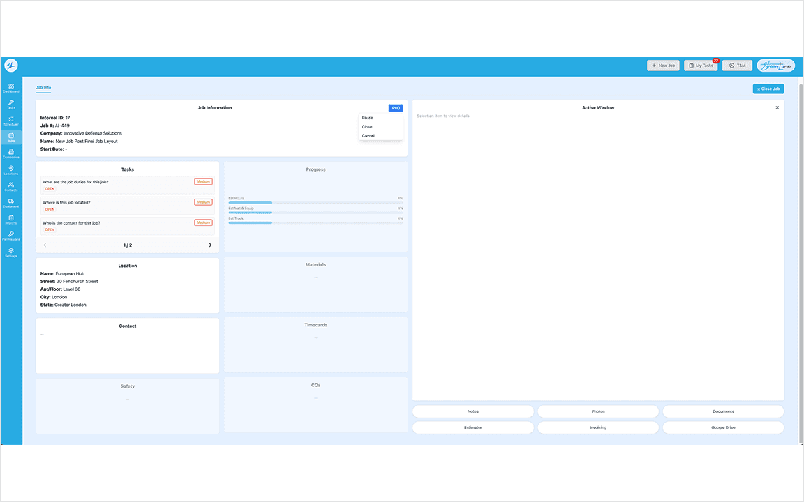
An electrical contracting company needed a way to track jobs from start to finish, across field and office users. The design had to surface the right information instantly without losing any of it.
Context, Goals, & Constraints
The client's existing Filemaker-based software was built for a small Apple-only team and they have outgrown its design and restrictions. The goal was a web-based overhaul of Job tracking that served two distinct user types with meaningfully different needs.
Personas
Project Manager & Office Admin Personas
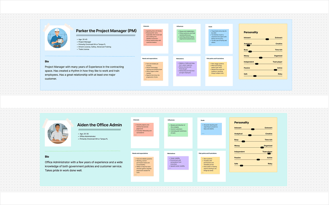
Personas
Parker, Project Manager (PM) - Field-first, manages technicians and customer relationships, de-prioritizes paperwork.
Aiden, Office Administrator - Supports PMs, owns the job life cycle documentation, licenses, contracts, and clearances.
Design Process
Whiteboarding
Used FigJam to Map Job Statuses
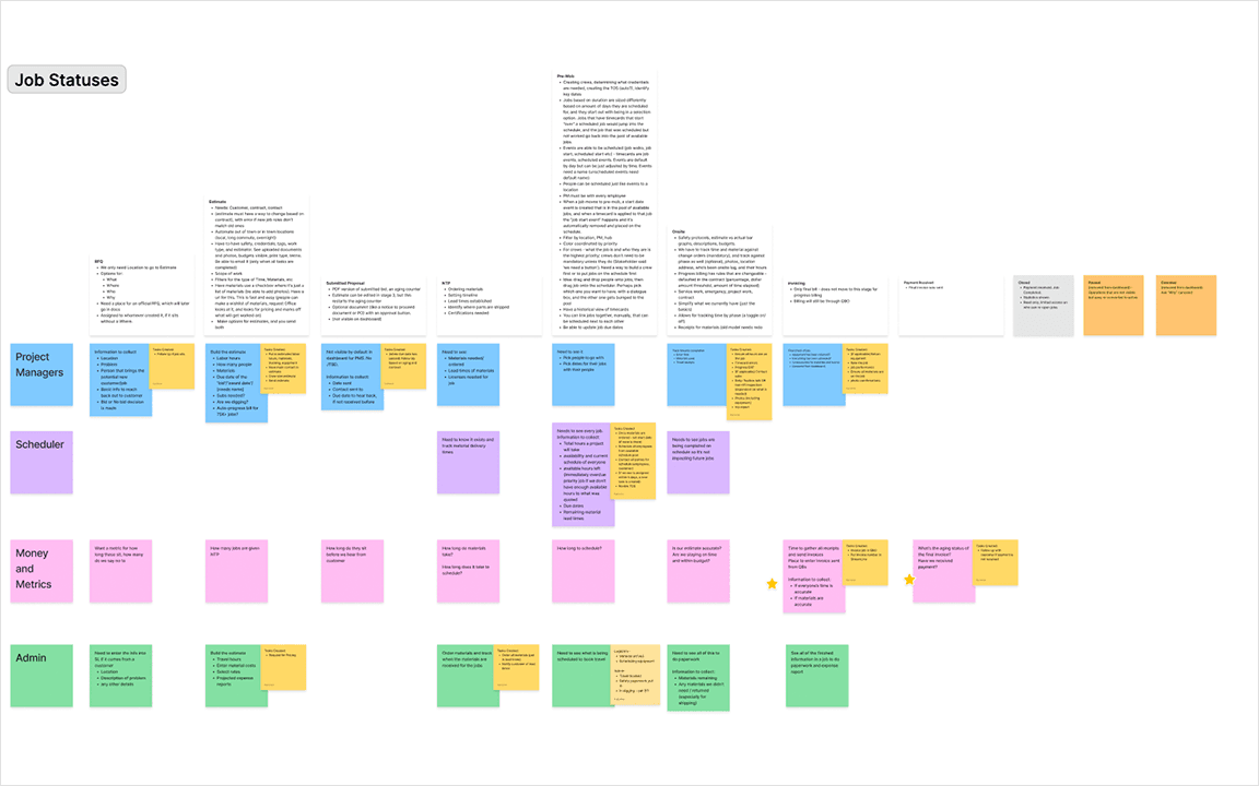
I began with stakeholder meetings to map out the entire job lifecycle, challenge existing assumptions, and capture any process changes. Prior experience at the company as a graphic designer informed my domain knowledge but a fresh perspective was a priority.
Mapping Critical Progression Qualifiers
Key Outputs:
Each Job Stage was documented, with 8 Job Stages and 3 Job Statuses
A breakdown of what each user type needed to complete at every stage to trigger progression was mapped
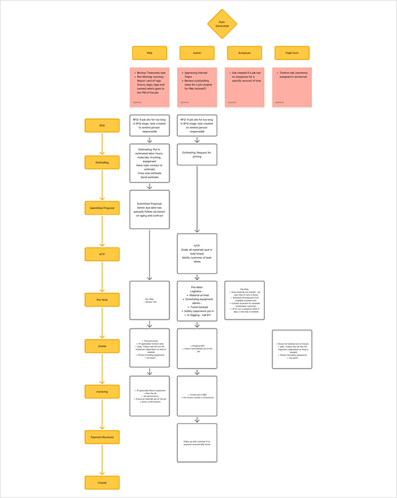
Flow
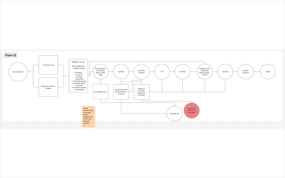
A simple visual flow charted how jobs move through stages. I kept this deliberately high-level as a shared reference point for the team.
Information Architecture
How Job Layouts Are Shown
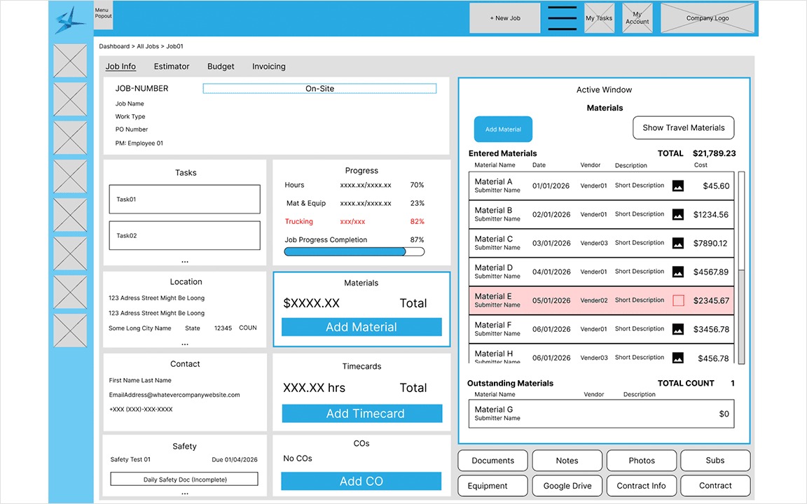
Rather than redesigning the layout at every job stage, which would force users to relearn the interface repeatedly, a consistent card-based system was established. When you select a card on the left of the screen a detailed view opens on the right. This keeps relevant information visible without overwhelming the screen.
Role-Based Views
Office View and Project Manager View
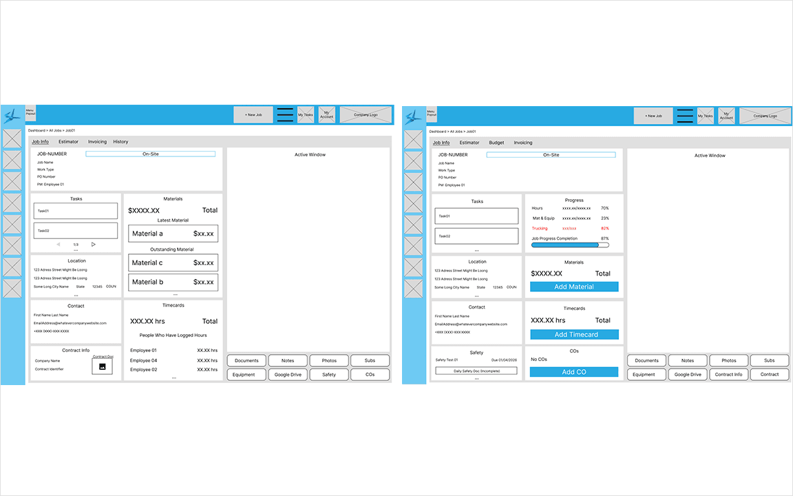
There are two roles for jobs:
Project Manger (PM) View - Personal materials, time cards, and field progress are critical
Office Administrator View - Job materials, contract information, and detailed customer tracking are prioritized
Dashboard
Looped Gif Walkthrough on Adding Customization to Dashboard
The dashboard was built as the first screen users see on login. It surfaces a condensed view of the most critical information across the application, with jobs and tasks as the primary focus.
Alternative Approaches
Task Display
Before and After
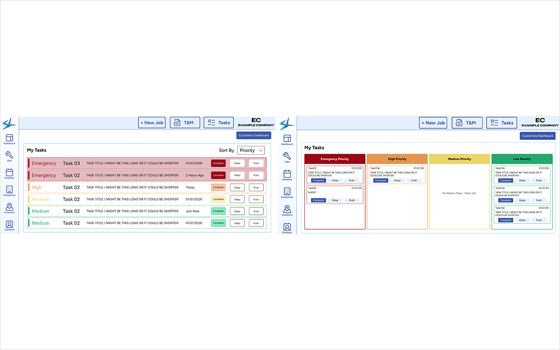
Early designs showed tasks as a prioritized list with colour-coded action buttons. User feedback was consistent in that it felt like a wall of text, with inconsistent button colours creating confusion about what actions were available.
The Fix:
Rebuilt as a kanban-style board with buckets and cards
Condensed the jobs into scannable content
Priority levels are visible at a glance without reading
Job Display
Before and After
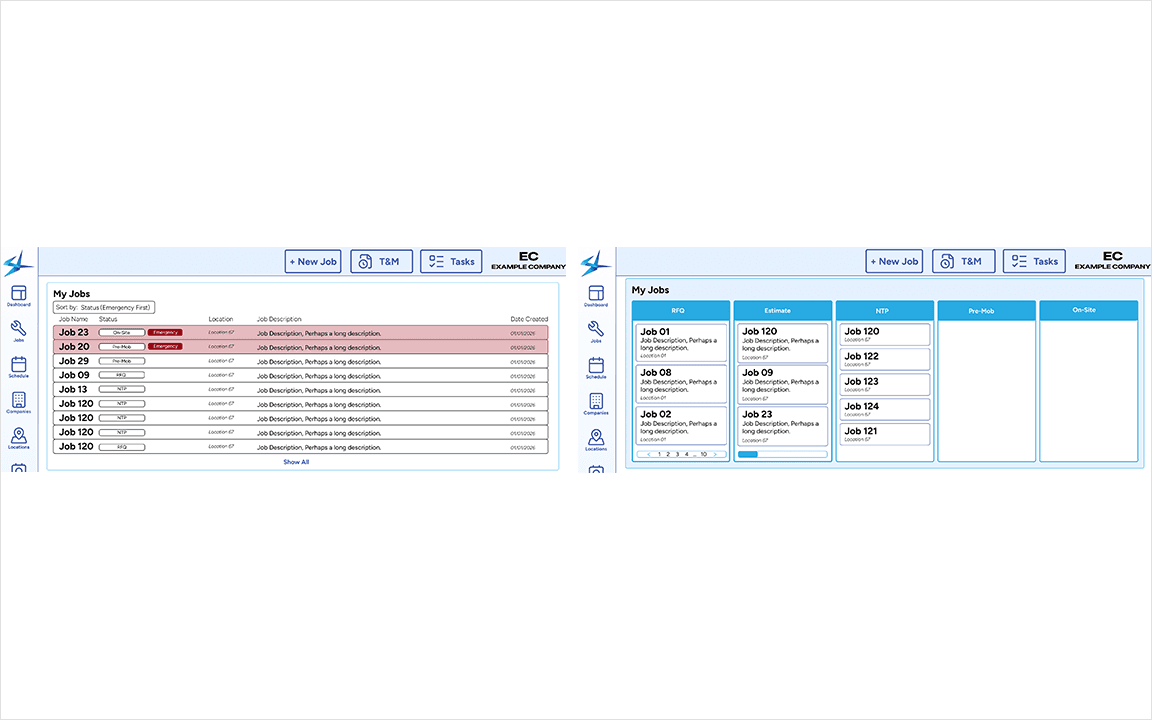
The same wall of text problem surfaced in the My Jobs screen. This was alleviated with the same kanban approach with buckets organized by job status.
Outcomes & Reflections
Screen of Live Version
The Jobs and Dashboard screens are live within the application, pending full system release to end users.
Results:
8 Job Stages and 3 Job Statuses mapped and designed
A full job life cycle tracker with progressive card unlocking across every stage
Role-based views ensuring each user type sees only what's relevant to them
A customizable dashboard that shows jobs and user tasks after login
A Note on Design Language - Task Display and Job Display both arrived at the same kanban-based solution. The card-based system was an information architecture decision that carried throughout multiple layers of design.
Reflections:
The UI for Jobs and Dashboard was not finalized before development. Given resource and time constraints usability was prioritized over polish, which was the correct call but more time would have been valuable
Prior experience at the company was critical for mapping the job lifecycle quickly, but a larger user sample would have sharpened the role-based view decisions
More Projects


UX / UI Design
Designed Job Lifecycle Tracker with Role-Based Views and Dashboard
Created a flexible card-based system to track contractor jobs from creation to end across two distinct user types
Tools
Figma, FigJam, Jira
Roles
UX Designer
Client
EQS, Inc (StreamLine)
Project Duration
4 months
Summary
Live Screen of Jobs
An electrical contracting company needed a way to track jobs from start to finish, across field and office users. The design had to surface the right information instantly without losing any of it.
Context, Goals, & Constraints
The client's existing Filemaker-based software was built for a small Apple-only team and they have outgrown its design and restrictions. The goal was a web-based overhaul of Job tracking that served two distinct user types with meaningfully different needs.
Personas
Project Manager & Office Admin Personas
Personas
Parker, Project Manager (PM) - Field-first, manages technicians and customer relationships, de-prioritizes paperwork.
Aiden, Office Administrator - Supports PMs, owns the job life cycle documentation, licenses, contracts, and clearances.
Design Process
Whiteboarding
Used FigJam to Map Job Statuses
I began with stakeholder meetings to map out the entire job lifecycle, challenge existing assumptions, and capture any process changes. Prior experience at the company as a graphic designer informed my domain knowledge but a fresh perspective was a priority.
Mapping Critical Progression Qualifiers
Key Outputs:
Each Job Stage was documented, with 8 Job Stages and 3 Job Statuses
A breakdown of what each user type needed to complete at every stage to trigger progression was mapped
Flow
A simple visual flow charted how jobs move through stages. I kept this deliberately high-level as a shared reference point for the team.
Information Architecture
How Job Layouts Are Shown
Rather than redesigning the layout at every job stage, which would force users to relearn the interface repeatedly, a consistent card-based system was established. When you select a card on the left of the screen a detailed view opens on the right. This keeps relevant information visible without overwhelming the screen.
Role-Based Views
Office View and Project Manager View
There are two roles for jobs:
Project Manger (PM) View - Personal materials, time cards, and field progress are critical
Office Administrator View - Job materials, contract information, and detailed customer tracking are prioritized
Dashboard
Looped Gif Walkthrough on Adding Customization to Dashboard
The dashboard was built as the first screen users see on login. It surfaces a condensed view of the most critical information across the application, with jobs and tasks as the primary focus.
Alternative Approaches
Task Display
Before and After
Early designs showed tasks as a prioritized list with colour-coded action buttons. User feedback was consistent in that it felt like a wall of text, with inconsistent button colours creating confusion about what actions were available.
The Fix:
Rebuilt as a kanban-style board with buckets and cards
Condensed the jobs into scannable content
Priority levels are visible at a glance without reading
Job Display
Before and After
The same wall of text problem surfaced in the My Jobs screen. This was alleviated with the same kanban approach with buckets organized by job status.
Outcomes & Reflections
Screen of Live Version
The Jobs and Dashboard screens are live within the application, pending full system release to end users.
Results:
8 Job Stages and 3 Job Statuses mapped and designed
A full job life cycle tracker with progressive card unlocking across every stage
Role-based views ensuring each user type sees only what's relevant to them
A customizable dashboard that shows jobs and user tasks after login
A Note on Design Language - Task Display and Job Display both arrived at the same kanban-based solution. The card-based system was an information architecture decision that carried throughout multiple layers of design.
Reflections:
The UI for Jobs and Dashboard was not finalized before development. Given resource and time constraints usability was prioritized over polish, which was the correct call but more time would have been valuable
Prior experience at the company was critical for mapping the job lifecycle quickly, but a larger user sample would have sharpened the role-based view decisions
More Projects
UX / UI Design
Designed Job Lifecycle Tracker with Role-Based Views and Dashboard
Created a flexible card-based system to track contractor jobs from creation to end across two distinct user types
Tools
Figma, FigJam, Jira
Roles
UX Designer
Client
EQS, Inc (StreamLine)
Project Duration
4 months
Summary
Live Screen of Jobs
An electrical contracting company needed a way to track jobs from start to finish, across field and office users. The design had to surface the right information instantly without losing any of it.
Context, Goals, & Constraints
The client's existing Filemaker-based software was built for a small Apple-only team and they have outgrown its design and restrictions. The goal was a web-based overhaul of Job tracking that served two distinct user types with meaningfully different needs.
Personas
Project Manager & Office Admin Personas
Personas
Parker, Project Manager (PM) - Field-first, manages technicians and customer relationships, de-prioritizes paperwork.
Aiden, Office Administrator - Supports PMs, owns the job life cycle documentation, licenses, contracts, and clearances.
Design Process
Whiteboarding
Used FigJam to Map Job Statuses
I began with stakeholder meetings to map out the entire job lifecycle, challenge existing assumptions, and capture any process changes. Prior experience at the company as a graphic designer informed my domain knowledge but a fresh perspective was a priority.
Mapping Critical Progression Qualifiers
Key Outputs:
Each Job Stage was documented, with 8 Job Stages and 3 Job Statuses
A breakdown of what each user type needed to complete at every stage to trigger progression was mapped
Flow
A simple visual flow charted how jobs move through stages. I kept this deliberately high-level as a shared reference point for the team.
Information Architecture
How Job Layouts Are Shown
Rather than redesigning the layout at every job stage, which would force users to relearn the interface repeatedly, a consistent card-based system was established. When you select a card on the left of the screen a detailed view opens on the right. This keeps relevant information visible without overwhelming the screen.
Role-Based Views
Office View and Project Manager View
There are two roles for jobs:
Project Manger (PM) View - Personal materials, time cards, and field progress are critical
Office Administrator View - Job materials, contract information, and detailed customer tracking are prioritized
Dashboard
Looped Gif Walkthrough on Adding Customization to Dashboard
The dashboard was built as the first screen users see on login. It surfaces a condensed view of the most critical information across the application, with jobs and tasks as the primary focus.
Alternative Approaches
Task Display
Before and After
Early designs showed tasks as a prioritized list with colour-coded action buttons. User feedback was consistent in that it felt like a wall of text, with inconsistent button colours creating confusion about what actions were available.
The Fix:
Rebuilt as a kanban-style board with buckets and cards
Condensed the jobs into scannable content
Priority levels are visible at a glance without reading
Job Display
Before and After
The same wall of text problem surfaced in the My Jobs screen. This was alleviated with the same kanban approach with buckets organized by job status.
Outcomes & Reflections
Screen of Live Version
The Jobs and Dashboard screens are live within the application, pending full system release to end users.
Results:
8 Job Stages and 3 Job Statuses mapped and designed
A full job life cycle tracker with progressive card unlocking across every stage
Role-based views ensuring each user type sees only what's relevant to them
A customizable dashboard that shows jobs and user tasks after login
A Note on Design Language - Task Display and Job Display both arrived at the same kanban-based solution. The card-based system was an information architecture decision that carried throughout multiple layers of design.
Reflections:
The UI for Jobs and Dashboard was not finalized before development. Given resource and time constraints usability was prioritized over polish, which was the correct call but more time would have been valuable
Prior experience at the company was critical for mapping the job lifecycle quickly, but a larger user sample would have sharpened the role-based view decisions