UX / UI Design
Designed a Time Card System For Desktop and Mobile
Built a mobile-first time card system serving every user permission level
Tools
Figma, FigJam, Jira
Roles
UX Designer
Client
EQS, Inc (StreamLine)
Project Duration
1 month

Summary
Live Time Card System
The client needed a way to clock employees in and out of jobs, track materials purchased for jobs, and allow employees without full system access to request internal time cards.
Context, Goals, & Constraints
Personas
Field Technician, Office Administrator, and Project Manager Personas
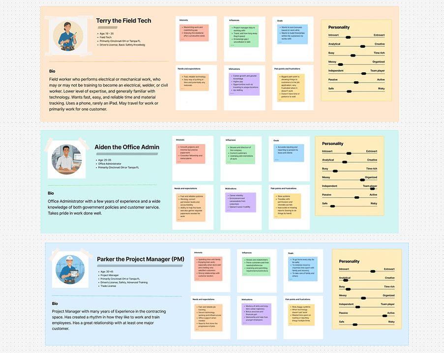
Personas:
Terry, the Field Tech- Mobile-only limited access, logging time and materials exclusively
Adien, Office Administrator- Accesses both the full desktop application and the mobile Time and Materials portion, owning the approval and error resolution processes
Parker, the Project Manager- Same access as Aiden, creates the Time Card tags
Design Process
User Flow
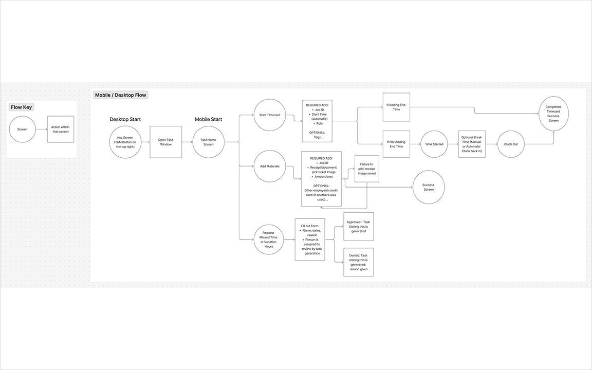
I started by mapping the nuances of clocking in and out before designing any screens. My key questions were:
What is the minimum information that a Time Card requires?
What optional fields apply to some jobs but not all?
Who gets notified when there are errors, and how does approval work?
I kept the process lean to prevent any scope creep.
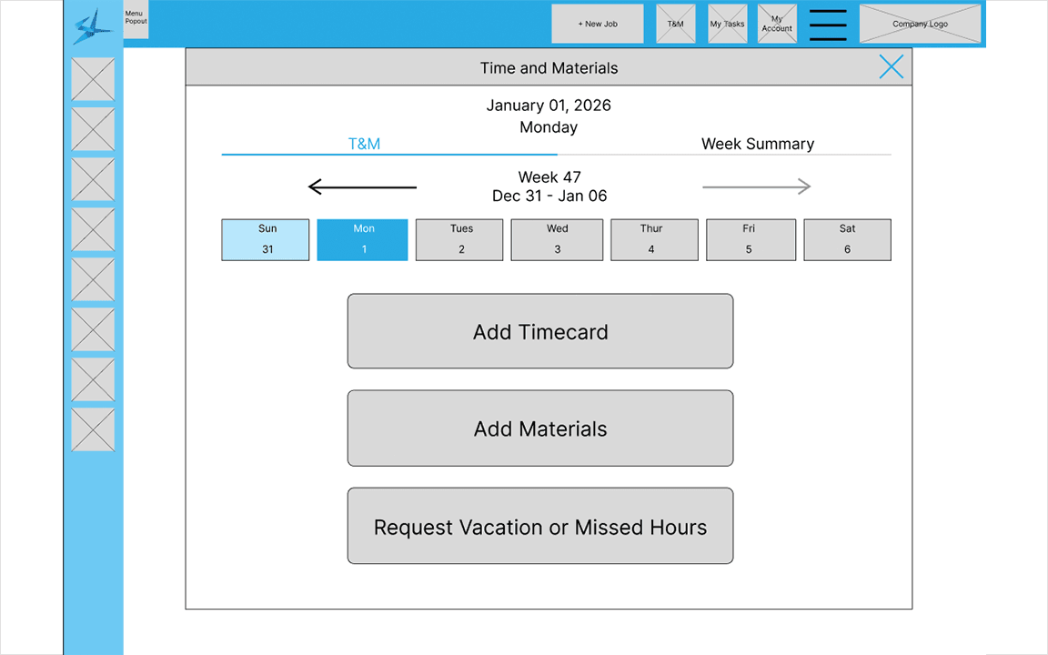
Mobile Wireframing Came First
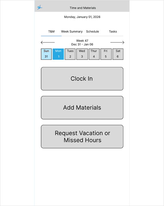
I decided to design the smallest, most widely used interface first. If it contained everything that Terry the Field Tech needed then it would be the strongest foundation for a desktop version.
Kept from the existing application:
Navigable calendar buttons
Weekly view toggle
Summary and scheduler views
Removed:
Per Diem and logged hours to display on calendar days, which had been creating a loading lag
Desktop Wireframing
After completing the mobile version the desktop version was built as a direct adaptation. Core design decisions were retained for consistency across both platforms, with modifications only where the larger screen warranted them.
Alternative Approach
Tags System
Before and After
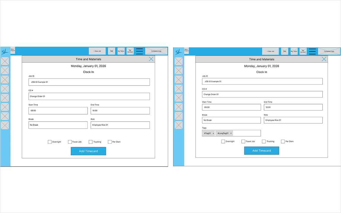
A stakeholder request was to introduce a tagging system into the Time Card creation process, aimed at building an internal training resource from daily field feedback.
For new tagging design solution:
Project Managers create and manage tags from a separate section of the application
Field Techs and Project Managers apply tags daily as part of the clock-out process
Tags are optional, keeping the core Time Card flow uncluttered for users who don't need them
Outcomes & Reflections
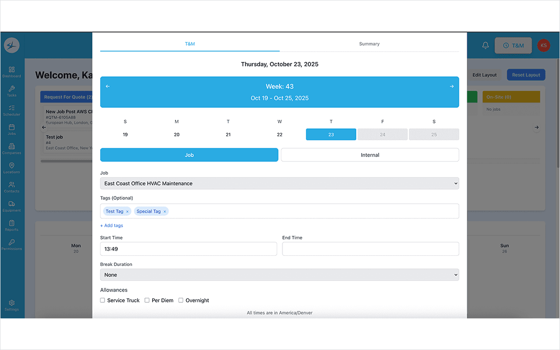
Screen of Live Version
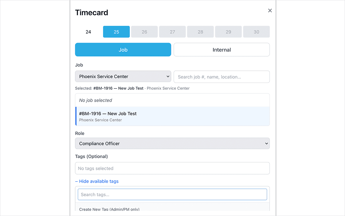
The clock-in system is live within the application, pending full system release to end users.
Results:
50+ employees will be using the system daily
A complete clock-in/out flow designed for both desktop and mobile
Role-based access serving three distinct permission levels from a single system
Internal Time Card requests built into the flow for employees without full application access
Tags system integrated without disrupting core Time Card experience
Reflections:
The materials portion was constrained to a bare minimum based on the existing system due to time limitations, and a redesign of that section remains a next step
More time with Field Tech users to understand their pain points would have been helpful
More Projects


UX / UI Design
Designed a Time Card System For Desktop and Mobile
Built a mobile-first time card system serving every user permission level
Tools
Figma, FigJam, Jira
Roles
UX Designer
Client
EQS, Inc (StreamLine)
Project Duration
1 month
Summary
Live Time Card System
The client needed a way to clock employees in and out of jobs, track materials purchased for jobs, and allow employees without full system access to request internal time cards.
Context, Goals, & Constraints
Personas
Field Technician, Office Administrator, and Project Manager Personas
Personas:
Terry, the Field Tech- Mobile-only limited access, logging time and materials exclusively
Adien, Office Administrator- Accesses both the full desktop application and the mobile Time and Materials portion, owning the approval and error resolution processes
Parker, the Project Manager- Same access as Aiden, creates the Time Card tags
Design Process
User Flow
I started by mapping the nuances of clocking in and out before designing any screens. My key questions were:
What is the minimum information that a Time Card requires?
What optional fields apply to some jobs but not all?
Who gets notified when there are errors, and how does approval work?
I kept the process lean to prevent any scope creep.
Mobile Wireframing Came First
I decided to design the smallest, most widely used interface first. If it contained everything that Terry the Field Tech needed then it would be the strongest foundation for a desktop version.
Kept from the existing application:
Navigable calendar buttons
Weekly view toggle
Summary and scheduler views
Removed:
Per Diem and logged hours to display on calendar days, which had been creating a loading lag
Desktop Wireframing
After completing the mobile version the desktop version was built as a direct adaptation. Core design decisions were retained for consistency across both platforms, with modifications only where the larger screen warranted them.
Alternative Approach
Tags System
Before and After
A stakeholder request was to introduce a tagging system into the Time Card creation process, aimed at building an internal training resource from daily field feedback.
For new tagging design solution:
Project Managers create and manage tags from a separate section of the application
Field Techs and Project Managers apply tags daily as part of the clock-out process
Tags are optional, keeping the core Time Card flow uncluttered for users who don't need them
Outcomes & Reflections
Screen of Live Version
The clock-in system is live within the application, pending full system release to end users.
Results:
50+ employees will be using the system daily
A complete clock-in/out flow designed for both desktop and mobile
Role-based access serving three distinct permission levels from a single system
Internal Time Card requests built into the flow for employees without full application access
Tags system integrated without disrupting core Time Card experience
Reflections:
The materials portion was constrained to a bare minimum based on the existing system due to time limitations, and a redesign of that section remains a next step
More time with Field Tech users to understand their pain points would have been helpful
More Projects
UX / UI Design
Designed a Time Card System For Desktop and Mobile
Built a mobile-first time card system serving every user permission level
Tools
Figma, FigJam, Jira
Roles
UX Designer
Client
EQS, Inc (StreamLine)
Project Duration
1 month
Summary
Live Time Card System
The client needed a way to clock employees in and out of jobs, track materials purchased for jobs, and allow employees without full system access to request internal time cards.
Context, Goals, & Constraints
Personas
Field Technician, Office Administrator, and Project Manager Personas
Personas:
Terry, the Field Tech- Mobile-only limited access, logging time and materials exclusively
Adien, Office Administrator- Accesses both the full desktop application and the mobile Time and Materials portion, owning the approval and error resolution processes
Parker, the Project Manager- Same access as Aiden, creates the Time Card tags
Design Process
User Flow
I started by mapping the nuances of clocking in and out before designing any screens. My key questions were:
What is the minimum information that a Time Card requires?
What optional fields apply to some jobs but not all?
Who gets notified when there are errors, and how does approval work?
I kept the process lean to prevent any scope creep.
Mobile Wireframing Came First
I decided to design the smallest, most widely used interface first. If it contained everything that Terry the Field Tech needed then it would be the strongest foundation for a desktop version.
Kept from the existing application:
Navigable calendar buttons
Weekly view toggle
Summary and scheduler views
Removed:
Per Diem and logged hours to display on calendar days, which had been creating a loading lag
Desktop Wireframing
After completing the mobile version the desktop version was built as a direct adaptation. Core design decisions were retained for consistency across both platforms, with modifications only where the larger screen warranted them.
Alternative Approach
Tags System
Before and After
A stakeholder request was to introduce a tagging system into the Time Card creation process, aimed at building an internal training resource from daily field feedback.
For new tagging design solution:
Project Managers create and manage tags from a separate section of the application
Field Techs and Project Managers apply tags daily as part of the clock-out process
Tags are optional, keeping the core Time Card flow uncluttered for users who don't need them
Outcomes & Reflections
Screen of Live Version
The clock-in system is live within the application, pending full system release to end users.
Results:
50+ employees will be using the system daily
A complete clock-in/out flow designed for both desktop and mobile
Role-based access serving three distinct permission levels from a single system
Internal Time Card requests built into the flow for employees without full application access
Tags system integrated without disrupting core Time Card experience
Reflections:
The materials portion was constrained to a bare minimum based on the existing system due to time limitations, and a redesign of that section remains a next step
More time with Field Tech users to understand their pain points would have been helpful